There are around 204,555 restaurants in the U.S, which proves that establishments must find creative ways to stand out.
Menu designs are an overlooked component of a business’s branding but it lets eateries add a personal flair and stay at the forefront of their patrons’ minds. Although it feels overwhelming, creating an arresting menu is simple once you know the basics. Perhaps you’ve toyed with the idea of elevating your menu’s design but you’re not sure where to start.
Sounds like you? Don’t worry, you’ve come to the right place. Here are the top menu design tips to consider.
Divide The Menu Into Logical Sections
You’ll notice that menu templates have divided their dishes into logical sections. This helps guide the customer’s eye so it’s easier to digest what your menu has to offer. For instance, at the very least have a “starter”, “mains”, and “dessert” category.
Avoid Using Too Many Photos
Every establishment in the restaurant industry understands overusing photos can make your business look amateur. If you do use images, make sure they are high-quality and compliment your menu. As a general rule, use photos for your high-margin items as it’s the best way to entice customers.
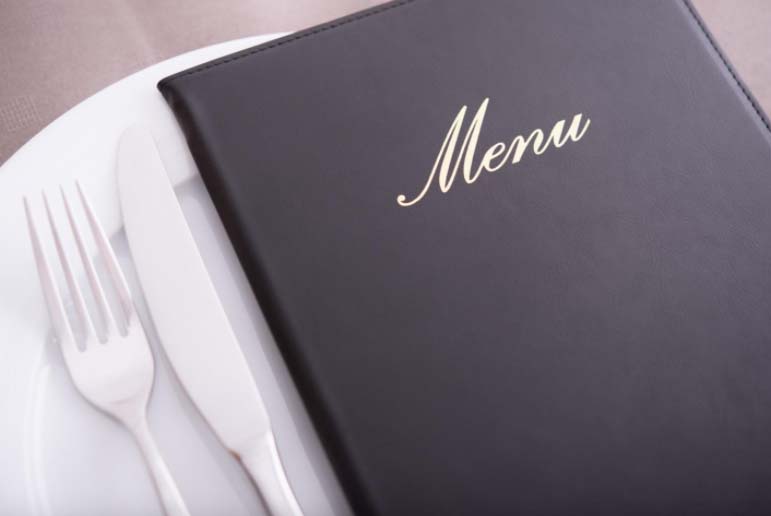
Express Your Brand’s Personality
Regardless of the type of restaurant you own, your design must express your brand’s personality. It’s important that it reflects your value and reaches your target demographic. For instance, if you’re a Michelin star restaurant, choose an elegant typeface and minimal design elements as it’s more striking.
Choose Appropriate Colors
The best menus embrace the restaurant’s colors as it strengthens their brand identity.
Make sure you choose colors that align with your eatery’s theme and are based on your target audience. You should also understand the psychological effects of each color so it sets the mood of your establishment and draws a crowd. For instance, red and yellow are often used by fast-food chains as it makes the consumer hungry.
Embrace Bold Typography
All types of menus can make a statement with the right typography. Remember, the typeface and its style reveal your establishment’s personality so take the time browsing options. For instance, a modern serif lets you make a statement while the script shows you run an upmarket establishment.
Ditch The Dollar Sign
Although money is crucial for every small business owner, the dollar symbol isn’t always necessary. You’ll notice most modern menus have dropped the sign so it looks more enticing. But don’t list prices in a single column as consumers will immediately compare prices.
Try These Menu Design Tips Today
Hopefully, after reading this article, you’ll use these menu design tips.
Make sure you divide the menu into logical sections, avoid using too many photos, and express your brand’s personality so you stand out from others. You should also harness the power of good typography and ditch the dollar sign for a cohesive design. Good luck in your design process!
Found this article helpful? Great! Then check out the rest of our blog for more tips and tricks.


